Pillars of Direct Mail

Author: Mike Dietz, Sr. Creative Director

I have been developing direct mail for more than 20 years. That’s right, before the digital age changed the way marketers connected with their customers.  To some, direct mail seems like an ancient marketing tool that should have gone out of style like pay phones. So why is it still such a critical channel for so many successful marketers today? The answer is simple…it works.

Creating direct mail campaigns in 2021 is dramatically different then creating them in 2000, but there are two pillars that remain the same and are the cornerstones to successful campaigns.

Get noticed.

The first pillar is the ability to create a physical piece that will stand out in the pile of mail that we encounter each day when we return from the mailbox.  We want to create a mail piece that makes it to the next round of scrutiny and not one that takes an express trip to the recycling bin never to be opened.

I want you to think about your personal process of sorting mail, what causes you to keep or to toss? How do you perceive size and weight? How do you interact with flashy promotional packages compared to simple plain envelopes with very little information on them? Unfortunately, there isn’t a black and white answer when it comes to selecting a creative approach. There are proven tactics that aid in the development of a successful mail piece, but each project provides their own set of unique factors. Brand recognition, audience, offer, budget and competitive pressure all contribute to the creative strategy that help shape the final product.

Convince me.

The second pillar is the challenge of motivating someone to engage.  To read or at least scan the contents of package and spark a desire that the product or service will save them money, create a sense of security or make their life easier.

Offer, benefits, and understanding the barriers that influence the consumers decision making process, make up the core considerations of messaging and positioning. These factors are driven by data and what we know about our audience. Much like the challenge of getting a mail piece opened, there is no magic answer. There are proven best practices that can be followed to establish a solid platform that you can build from.

Harder than you think.

Direct mail creation is hard. To be successful, the piece needs to capture the consumer’s attention in a short period of time. The wonderful thing about this channel is that everything is measurable. The other amazing thing about direct mail is that it will never be perfect. Ongoing testing is the lifeblood in developing consistent and healthy programs. Understanding what is working (and not working) is critical. Testing insights need to be strategically leveraged to improve controls or develop innovative creative challengers.

Experience Matters.

As you can see, there is a lot to think about when you take on a direct mail project.  Life in the world of direct mail is never boring; each day brings new challenges and new puzzles to solve. I haven’t even mentioned production or postal requirements. I will save that for another blog.

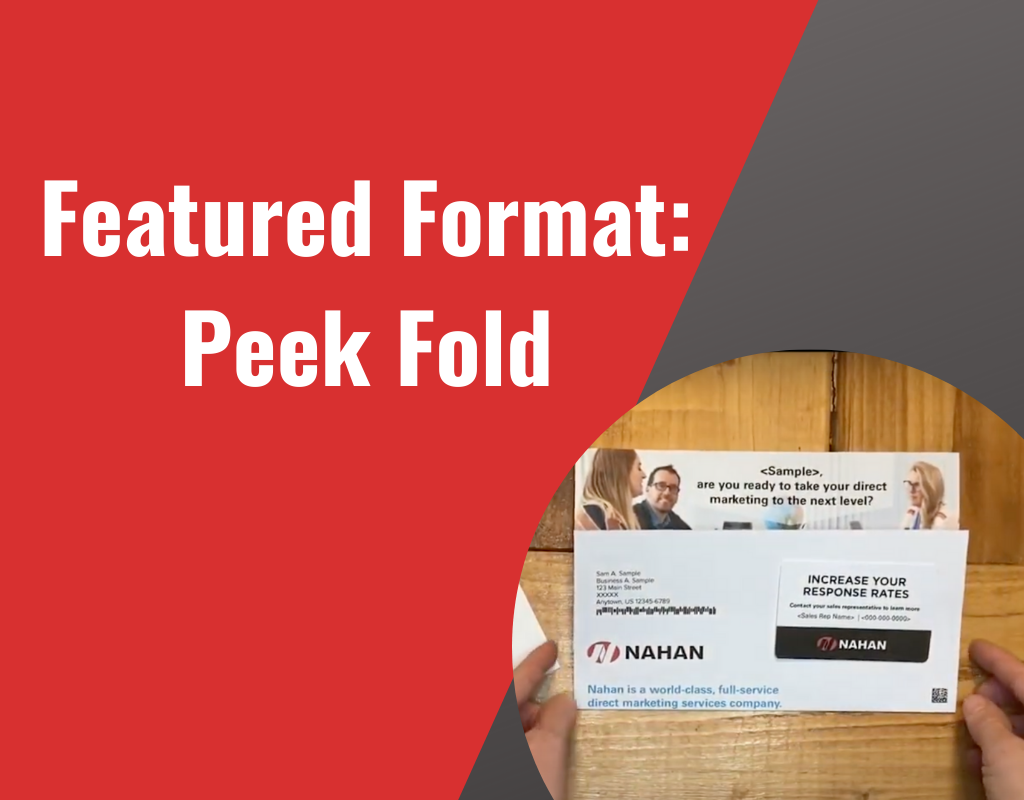
Looking for a Unique Take on Direct Mail? Try the Peek Fold Format!

Author: Laura Karels, Lead Designer

Check out our spin on a traditional direct mail format with the peek fold format. You’ll grab your recipient’s attention with a personalized headline as the first thing they see when they pull this peek folded letter out of the envelope. The longer form allows for a traditional letter using direct mail best practices along with extra real estate for a branded or promotional panel.

  • Unique folded letter peeks a large headline at the top
  • 14” long form for additional real estate
  • Tip on card for a tactile feel
  • 6” x 9” envelope stands out in the mailbox
  • Options: Fold style can be incorporated on other size formats

Watch the short video below to see the peek fold format in action!

For more inspiration, check out our other format ideas, including a double gate mailer, iron cross mailer, and 5 panel rollfold mailer.

Bio: Laura Karels is our Lead Designer. She is responsible for all things direct marketing design—from format sketches to final art—and truly enjoys the creative process of helping clients develop winning direct marketing campaigns. In her spare time, Laura enjoys great coffee and cross-country road trips with her family. She’s also getting really good at finding humor in her husband bringing home yet another “project” vehicle.

Direct Mail Design Best Practices: Personalization Matters

Author: Laura Karels, Lead Designer

Designers of all mediums have best practices they follow when creating their best product and direct mail designers are no different. One of the most important best practices in direct mail design is using personalization and using it well.

Direct mail personalization has come a long way from just using the recipient’s name and address. Digital print technology and highly targeted data has allowed marketers to personalize direct mail design in creative ways. Personalization is proven to drive better response rates and who doesn’t want that?!  

Ways to get personal…

Imagery

Images can be personalized based on segmentation data, business vertical type, location, and more. Visuals the recipient can relate to can be very powerful.

Offers

Targeting offers to a recipient’s consumer history or specific needs are more likely to get response from your direct mail. Response rates can increase up to 50% or more when targeting consumers on a 1:1 level. (thedma.org)

Geo-Targeting

One of the easiest ways to personalize and get impact is the use of maps and locations within the direct mail design and copy. This is also information that is part of the basic data—it can simply be pulled from the address block.  

Copy

The words you use can be personalized in so many ways. Using the recipient’s name, address, consumer history, business type, etc. in thoughtful ways within the copy can entice the reader and increase response. According to the ANA (formerly DMA) simply adding a person’s name can increase response by 135%!

Forms

If your direct mail format includes a form or response device, prefill out the form with the recipient’s data to make responding easier.

These are just 5 ways to use personalization within direct mail design but digital print technology has opened the door to so much more.

Check out this example of a mailer that was designed to contain 57 variable pieces of data and photos, resulting in increased engagement and a higher ROI per piece vs. previous direct mailers! Contact Us to see how we can help you effectively use personalization in your next mailing.

This is part of our Design Best Practices Blog Series. Look for more best practices in future blog posts.

BIO: Laura Karels is our Lead Designer. She is responsible for all things direct marketing design—from format sketches to final art—and truly enjoys the creative process of helping clients develop winning direct marketing campaigns. In her spare time, Laura enjoys great coffee and cross-country road trips with her family. She’s also getting really good at finding humor in her husband bringing home yet another “project” vehicle.