The 5 F’s of Color – The Challenges and How Nahan Achieves Color Matching
Nobody wants purple apples or green faces on their beautifully printed products. Nahan is proud to be a G7 Master Certified Facility and we also have two G7 Experts on our team. Color matching is just one of the ways that Nahan ensures a quality piece on every single product that goes through our doors. Let’s explore color matching and how Nahan deals with challenges regarding color.
Note: G7 is an international standard for ensuring color matching across multiple platforms.
What is the most challenging part about color matching on press?
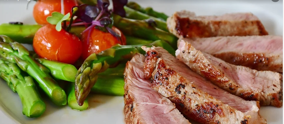
Well, let’s just say there are many. Some images are a challenge without having to share the spotlight with other images. For example, a fresh cut steak could look inedible if not done right. Often times, the most challenging are the ones you want to look the best.
Which ones are most challenging?
Here are what we like to call as the 5 F’s: Flesh tones, Fashion, Furniture, Fur and Food. These are challenging because if a little off-color, furniture can look cheap and food can look unattractive. Of course, these images may be your focal point and not getting them right can tarnish your brand.

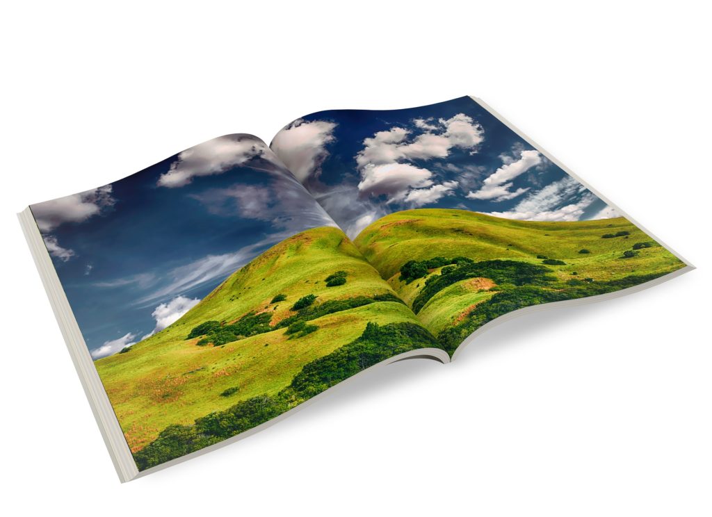
While on their own they may not be challenging, some images can collectively pose serious problems for a printer. Once a color is set on the first press form, all subsequent press forms are then driven by that first form. If there are crossovers, there could end up being some significant compromises.
Note: A crossover is one image running across multiple pages and possibly multiple press forms.

How do you deal with them?
First: Prioritize your images and press forms
- Go to your printer and do a “Press Check,” approving color on press.
- Consult with your salesperson, look at all the forms and decide which one to start with – probably one with a couple of crossovers.
It is easy to be tempted to start with a form that has a bright color, corporate color or someone’s favorite photo and push the ink to make it pop. However, it is important to be careful with this. The next form may be a neutral and crossover to that first form and you may end up with a spoiled image.
Second: Make sure you are running to strict standards and specifications such as Gracol/G7
- G7 is a method for achieving visual similarity across all print processes.
- Here is a link to Idealliance (G7 standard certifying body and ISO standard developer).
The use of real estate on the press sheet can be a challenge since different ranges of colors need to run in-line with each other. Perhaps it is fruit running in-line with flesh tones, or furniture running in-line with jewelry, which makes one image more difficult to hit your desired color.
- Often there are limited choices as to what you can do about these.
- You could stop the press and have a color technician mask off and color correct a disagreeable color area, however, this can be very expensive.
- You could anticipate certain colors being a challenge and run a spot PMS color.
- Running to a standard helps ensure matching to proof.
- Make sure if you are supplying a color proof that it has color bars and has been produced to a standard like GRACOL / G7 or FOGRA.
Third: Paper quality is really important
- Show-through with a lightweight paper can affect color.
- Show-Through: the image on the back side of the sheet is visible on the front side affecting whiteness
- Sheet color can also affect print colors.
- Sheets – come in different brightness and shades (Generally a good sheet has a brightness of 92 or higher)
- Paper grain gives the sheet stability.
- This can affect registration, which can in-turn, affect color. As sheets distort under the pressure of the printing press, the registration can move. This can cause color to shift and images to slur.
- A good quality stable sheet will help with critical color matches.
- If you are using uncoated or matte papers, the right calibration curve for those papers is very important.
- Your experienced color technician should control this.
Fourth: Presses need to be in good mechanical condition, with repeatable results
- This may be out of your control, but you can tell if you have chosen a printer wisely by how clean the machine is, or by how much your team cares about their work environment. When choosing, ask about their press maintenance schedule. Often times, their response can tell you a lot.
- Experienced press crews and an amazing maintenance department make all the difference in the world!
Nahan as a Trusted Color Expert
Nahan has two G7 Experts and Color Technicians who are here for consultation and will be at press as needed to help ensure premium color. We regularly calibrate our machines to ensure our high standards are met. Our presses are maintained by experienced press crews at regular intervals and we have a full maintenance department to help ensure all the G7 calibrating time is achievable and print results are repeatable.
In the event of a difficult color, our G7 experts can often achieve desired results without color correction, but rest assured, they are here for you if it is needed.
Nahan is a G7 Master Printer which means we have calibrated certain equipment to G7 gray balance & neutral tone curves for proofs, Offset & digital presses.
Interested in learning more about Nahan? Contact us to learn more about our printing services.
Bio: Jim Hesch is the head of Customer Service at Nahan and a certified printing geek. (Always make sure you print with someone who is certified)…


